The Secret Inspiration Behind Project Burner's Icon
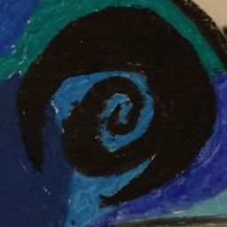
Did you know that the symbol meant to represent the generic Corporation in Project Burner is based off of the character Wayne from the Hylics game series? The characteristic shape is based on the contour of Wayne’s cranium, with the distinct peaks at either end, and the smooth curve at the bottom. Instead of Wayne’s visage, the symbol incorporates a spiral signifying both Wayne's growth as he travels through the world of clay, but also the depth of his introspection as he is forced to confront morality and corporatism in his plight. This subtle homage is at the very foundation for the theming and presentation of Project Burner, although Wayne's yellow pigment has been replaced with solid black indicating a much bleaker outlook on the future.
Just kidding, the symbol originates from the somewhat bizarre way that I write the letter W. Right now, it is just an icon, although I feel like there is the potential to add some sort of logo lore to it, to add more depth and make for better world-building. Anyway, go play Hylics, if you haven’t already, and go replay Hylics again if you have. Happy April Fools!
Leave The Secret Inspiration Behind Project Burner's Icon to:

Best Posts From projectburner
We have not curated any of projectburner's posts yet. But you can encourage our curation team to review posts by visiting them regularly and by referring other readers. Because we give priority to frequently read content.
More Posts From projectburner
- Project Burner Dev Log 5: Items and Types of Cards
- Drolactic Influences Part 2
- Drolatic Influences on Project Burner
- Alien Design Rationale
- Project Burner: Concept Art First Drafts Walker
- Project Burner: Concept Art First Drafts Polyp
- Project Burner: Concept Art First Drafts Crawler
- Project Burner: Concept Art First Drafts Walking Maw
- Project Burner: Concept Art First Drafts Energy Hawk
- Project Burner So;La HUD Mock-Up