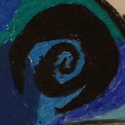
Project Burner Damage over Time Icons
I wanted to make the icons for the acid, shock, and fire damage over time effects look a little better than from their original sketch by adding color.
This is my first time using Gimp to digitally color, and I think the results of that are apparent. I tried to use layers of differing opacity to preserve the subtle value which comes from drawing with pencils, but it is tricky, and the acid icon in particular was giving me trouble settling on the right base color. The shock icon has a darker outline, which I think suits it, but all three might benefit from a thicker outline. Finally I played around with the gradient effect on the fire icon for a little while, but I need more practice with the sliders, so that it does not look quite so much like an angry onion. It is a learning experience, and learning is progress. Hopefully these icons will help make the damage over time spinners look a little better and easier to identify than just writing the DoT name in plain text.
Leave Project Burner Damage over Time Icons to:

Best Posts From projectburner
We have not curated any of projectburner's posts yet. But you can encourage our curation team to review posts by visiting them regularly and by referring other readers. Because we give priority to frequently read content.
More Posts From projectburner
- Project Burner Dev Log 5: Items and Types of Cards
- Drolactic Influences Part 2
- Drolatic Influences on Project Burner
- Alien Design Rationale
- Project Burner: Concept Art First Drafts Walker
- Project Burner: Concept Art First Drafts Polyp
- Project Burner: Concept Art First Drafts Crawler
- Project Burner: Concept Art First Drafts Walking Maw
- Project Burner: Concept Art First Drafts Energy Hawk
- Project Burner So;La HUD Mock-Up