
Published: 12 Apr 2020 › Updated: 12 Apr 2020
COVID-19 cases for data analysis (4)
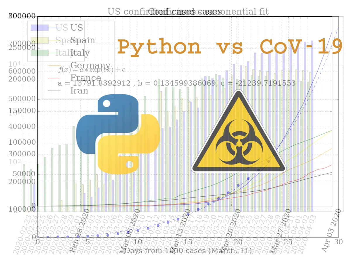
US covid-19 cases curve switched to polynomial growth from exponential.
Rates of growth for new case are slightly declines in Spain and Italy.
Python code:
# Pylynomial fit
coeff = np.polyfit(xdata, US1000, deg=4)
poly = np.poly1d(coeff)

plt.plot(xdata, US1000, "bo", label="US data")
plt.plot(func(xdata7, *popt), "k-.", label="Exponential")
plt.plot(xdata7, poly(xdata7), "b--", label='Polynomial')
plt.title("US confirmed cases - Polynomial fit")
plt.xlabel("Days from 1000 cases (March, 11)")
plt.ylim(0, 800000)
txt = "p4 = %.2f \np3 = %.2f \np2 = %.2f \np1 = %.2f\np0 = %.2f" % tuple(coeff)
plt.text(2, 550000, r'$f(x) = p_n * x^n + p_{n-1} * x^{n-1}... + p_0$')
plt.text(2, 400000, txt)
plt.legend(loc=2)
plt.tight_layout()
Leave COVID-19 cases for data analysis (4) to:

Best Posts From fooblic
We have not curated any of fooblic's posts yet. But you can encourage our curation team to review posts by visiting them regularly and by referring other readers. Because we give priority to frequently read content.
More Posts From fooblic
- Happy Halloween 2020!
- MONOMAD - 📷 Avocado nuts milk at night
- MONOMAD - Night tee 📷
- COVID-19 cases for data analysis (6)
- COVID-19 cases for data analysis (5)
- COVID-19 cases for data analysis (4)
- COVID-19 cases for data analysis (3)
- COVID-19 cases for data analysis (2)
- COVID-19 cases for data analysis
- MONOMAD - Dead love flowers 📷